
2019 Wedding Colour Inspiration
Ellie McGrath

Planning a wedding this year and in need of some colour inspiration?
Well never fear! Global colour gurus, Pantone, have partnered with global wedding gurus, WeddingWire, to curate four inspiring wedding colour palettes that you’re sure to fall in love with!
Colour is one of the main themes people choose when planning weddings or parties. It can tie all the elements of your day together, from the early “save the date” info to the final Thank you notes, from the ceremony to the reception.
Colour is chosen for many reasons, it could be simply the couples favourite colour, it could be used to create a certain mood or atmosphere, it could also have spiritual or religious meaning to the couple.
Weddings may also have a literary theme (think Alice in Wonderland or Jane Austen), a pop culture theme (Anime, unicorns), be Music themed (with instruments or album covers providing inspiration) or film themed (based on a wedding from a favourite movie).
Whatever the main theme is - you still need to consider colour.
On the invitations and stationery, clothing, table centrepieces, place settings, table wear, flowers, cars, jewellery…and the list goes on…
A great way to keep track of what you like is to create a Pinterest board or a more traditional mood board, including all the things you want your wedding or other event to include.
Then, even if you’re unsure of what colour chair sashes to choose, or what colours to have on the invitations, you can show that inspiration board to your designer, event manager, wedding planner or other professional and they will be able to provide options that fit within your taste.
Save it on your phone or tablet so you have it handy at all times!
Remember - If you’re really stuck, your stationery designer or wedding planner will be more than happy (and qualified) to help!
The 2019 Wedding Color Palettes by WeddingWire x Pantone Color Institute are:
LOVE IN BLOOM:
As the name suggests a floral inspired palette with pinks, greens and silvers

Image from Pantone
GOLDEN HOUR:
A warm, neutral palette of creams, oranges and pale gold

Image from Pantone
PARADISE FOUND:
A tropical inspired palette lush with blues and greens with pops of orange and white
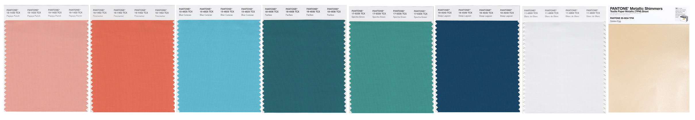
Image from Pantone
STROKE OF MIDNIGHT:
Moody and crisp palette of dark blues and purple shades set against bright white and metallics

Image from Pantone
“Color is a powerful tool – not just for enhancing aesthetics that are critical to every element of a wedding – but to evoke emotion and create the special mood that a couple wishes to communicate throughout their special day from playful and adventurous to romantic and timeless, and everything in between.”
“In concert with the resources and planning tools from WeddingWire, these custom palettes created by The Pantone Color Institute are intended to help couples navigate their color and design choices in an inspiring, meaningful and uniquely memorable way.”Laurie Pressman, Vice President of the Pantone Color Institute.
For more information and to see the palettes in action, visit weddingwire.com/pantone